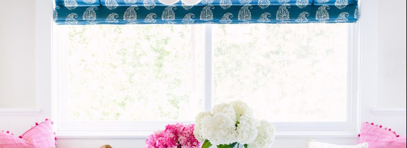
By JoAnne Lenart-Weary
Did you know color is the first thing we see followed by shape? Color impacts us visually, emotionally and even physically because we can actually “feel” some colors.
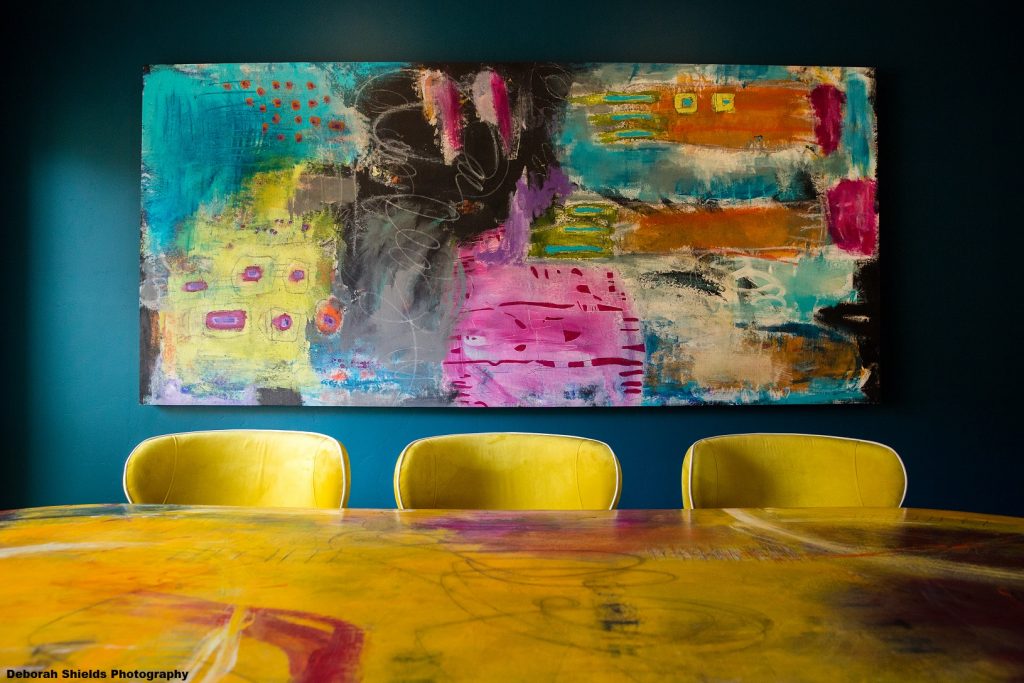
Pattern and texture elevate color to the next level. The ability to mix all three with panache can take a room to new levels of fabulous. The best rooms not only delight your eyes but make you want to touch and feel your way through the space. Let’s get inspired by the work of some talented designers who demonstrate my “get it right” guidelines.
Complete, Not Compete
The true key to color palette success is not the mix of hues but of saturations. If the intensity of one color completely distracts from the others, chances are you are witnessing competing saturations.
In the room above, the talented Rachel Moriarty of Rachel Moriarty Interiors in San Diego creates a fabulous color recipe of deep values and completing saturations. The use of yellow in the art also brings the eye up, making the space seem larger.
Find the Common Thread
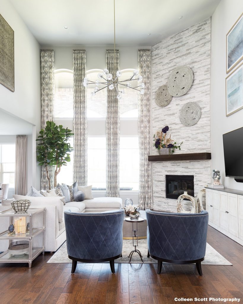
When mixing patterns and textures, it is essential to find the thread that creates visual cohesion with color, motif or contrast. Nikole Starr with Nikole Starr Interiors in Richmond, TX, blended all three by first applying contrast. The walls and window treatments have a light background with a darker motif. They contrast with the chairs, which do the exact opposite, providing a dark background contrasting the light diagonal lines. Notice how she also brings the blue up in the art, again lifting the eye and honoring the tall ceilings in room. The pattern around the fireplace works perfectly with the custom draperies because they carry the common thread of color with contrasting lines and motifs.
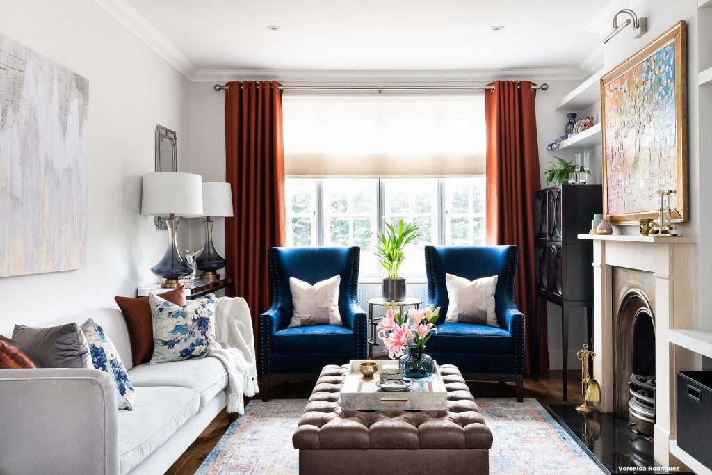
In this beautiful room by Christine Tse of Christine Tse Interiors in London, the art married the complementary color scheme and brought the room together. It established the common thread that pulled the room together.
Pop It with Color
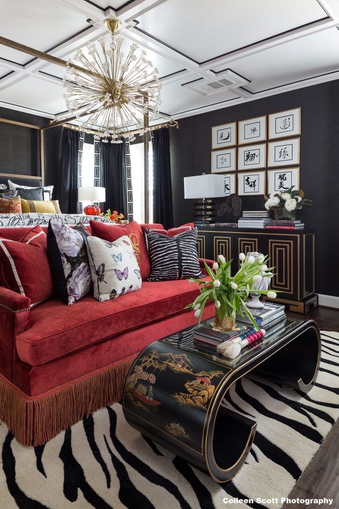
Black may be the common shade in this room, but it gets more exciting with the addition of the rosy-red sofa in this beautiful room by Veronica Solomon with Casa Vilora Interiors in Katy, TX. Notice the color is repeated in the Chinoiserie table and then very subtly again in the book binding on the sideboard. When popping an accent color, repeat it three times at different levels in the room. Never divide colors evenly.
The September/October issue of Window Fashion VISION is our annual color issue. Interested in getting more information about the latest and greatest in color and decorating trends? Sign up for a subscription today. It’s FREE for anyone in the design industry!
Texture Times Two
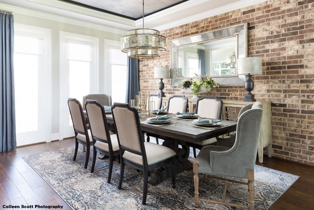
We feel texture twice: with our eyes and then with our hands. In today’s world, the mix of unexpected pairings adds interest and contrast to every room. The key is to use texture at multiple heights and blend rough with smooth. Nikole Starr did exactly that by blending the rough texture of brick with the smooth velvet on the dining chairs (see below). The visual texture of the chandelier adds weight and balance. If you opt for modern wood dining chairs and drop lights for your home, you do so because you feel more connected to that type of visual style. You will want to shop around to see what available chandelier styles are out there that will suit the overall look of your room design so you can be assured of your decision. Going onto websites like lightart.com and checking out their chandelier drum light as well as others, will get you in the right mindset for what you require.
That said, once you have selected the style that suits your taste, it would be recommended to contact an electrician who could install the lighting fixture. For that, you can simply look for Calibre Connect (according to them, “pricing from our Sydney electricians happen to be quite affordable compared to others”) on the Web and book an appointment with a handyman who could do the job for you.
What Goes with What?
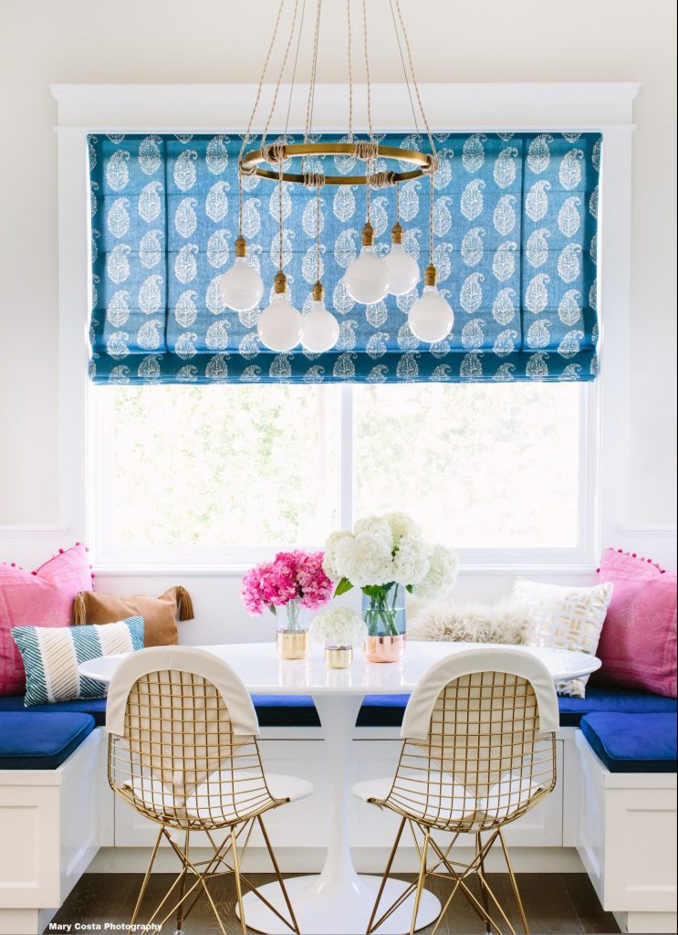
Once you select your color palette, have fun with pattern. The best combinations include a statement pattern mixed with a smaller-scale pattern, a directional fabric and a blend of texture and sheen. Jessica McClendon with Glamour Nest Interior Design illustrates this perfectly in this cozy and colorful kitchen (right).
Here is my cheat sheet of combinations that work every time.
- Toile, Stripes, Checks
- Floral, Geometric, Stripes
- Floral, Geometric, Polka Dots
- Ikat, Plaid, Floral, Mini
- Floral, Geometric, Texture


