By Taryn Pearce
We are all spending more time at home now and many people are looking to redesign or decorate their homes to better reflect who they are and what they need. From functionality to beauty, designers are being asked to use their creativity in new and exciting ways to create bolder interior design looks.
Clients may have their own ideas, but they will be looking to their designer to guide them. Sometimes, that means offering an unexpected choice that your client wouldn’t have ever dreamed of on their own. The suggestions that professionals make might sometimes also include ideas that would require a firm that does home remodel in Boulder or elsewhere. These ideas may seem out of the box to the client at first, but a savvy designer knows that a few audacious choices can give their client the results they never even knew they wanted. Sometimes these ideas can set the homeowner back a fair bit financially speaking, depending on how ambitious of a project is proposed. Therefore, some people may want additional support in the form of home improvement loans in order to pull the project off – go to this website to check out the financial services available for this purpose.
Keely Hersh, owner and designer for Right at Home Interiors, knows a thing or two about bold designs. She provided seven proven ideas that will add that serious “wow” factor to your next client’s home.
Vibrant Paint Colors for the Walls and Ceiling
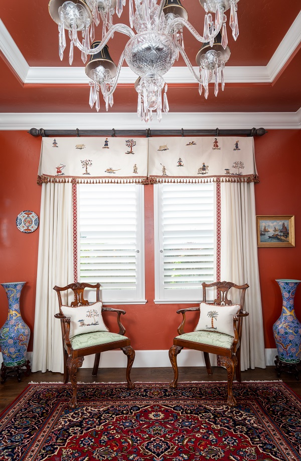
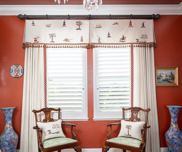
A seasoned designer may not shy away from daring paint colors, but some clients may hesitate at the idea. Show them examples of successful past projects where bright or intense shades played a key role.
Also, encourage them to paint the ceiling. Let them know that an unpainted ceiling makes the room feel incomplete. Again, photos to illustrate your point will be helpful. A fully painted room in a bold color can help the details of their space that would otherwise go unnoticed to stand out.
The walls and ceiling in this room used to be pure white. The paprika-red color shown here allowed the light color of the drapes to really pop. It also gave the room dimension and accentuated the beauty of the drapes and crown moulding.
To-Die-For Fabrics
A beautiful fabric can be the inspiration point for the entire space. Don’t be afraid to share luxurious, textured or uniquely patterned fabric options with your client, even if you think they’ll balk at the choice. Once they see your vision for the fabrics, they’ll be more likely to get on board. The fabric can then become the inspiration for your color palette and mood board.
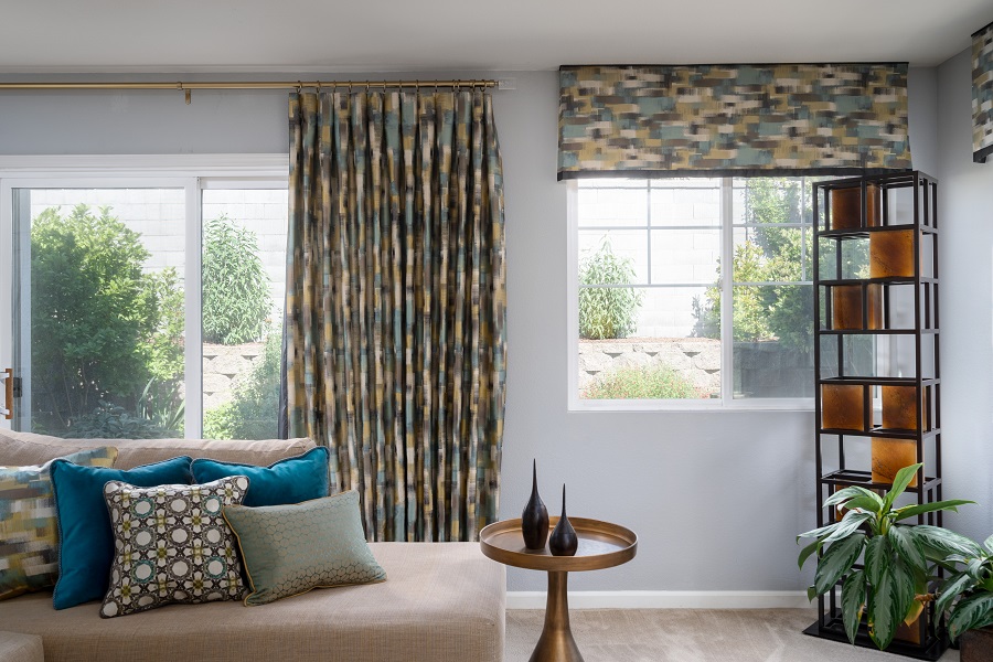
An abstract fabric was the inspiration for this living room Hersh designed for her client. The fabric was then used to help with paint color selection and to create drapes, valances and pillows that highlighted her client’s modern style.
Mixed Textures and Materials
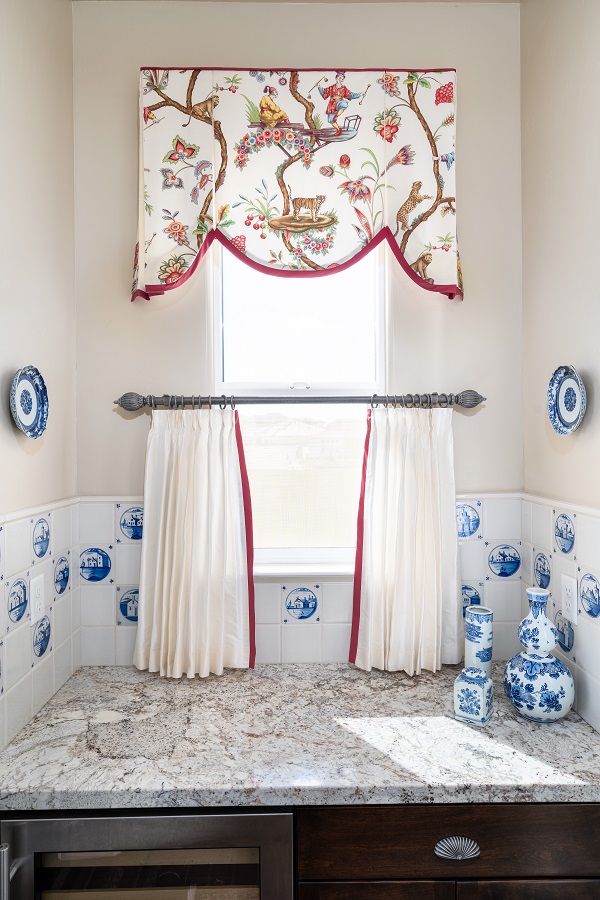
Deft material combinations take real expertise. Your client may want to stick with similar textures for their design, but guide them to focus on the style, not the material. They may not be able to see how combinations like wood and silk or tile and chrome can work in their space at first, but that’s where your fine eye and skills come in.
Share with them the possibilities of mixing materials within a single cohesive style for their home the same way they would in an outfit. The comparison may help them better understand how the materials you’ve chosen will work together. If they’re struggling to visualise your ideas, show them some of the furniture pieces here. This will give them a chance to browse different styles and will hopefully provide them with some inspiration.
This pantry bar is located between the pantry and dining room of Hersh’s client’s home. A scant 1-yard piece of fabric was used to design a valance. Blue antique tiles matched with modern-day tiles to make a gorgeous backsplash. Along with the bar’s red accents and white silk cafe curtains, these design choices create a flow between the pantry and dining spaces.
Dramatic Floor-to-Ceiling Cabinets
There’s nothing like custom cabinetry to really transform a space. Go for a real stunner in your client’s home with towering cabinets that stretch from the ground to the ceiling. Deep, intense paint hues add additional drama, as do ornate crown moulding or unique hardware.
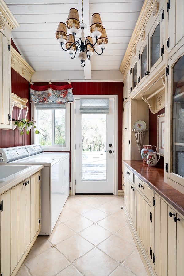
Hersh had brand-new custom floor-to-ceiling cabinets designed to fit the slanted ceiling in this fully remodeled laundry room. The red walls and dark hardware give contrast to the room while accentuating the antique details of the cabinets.
A Dynamic Color Palette
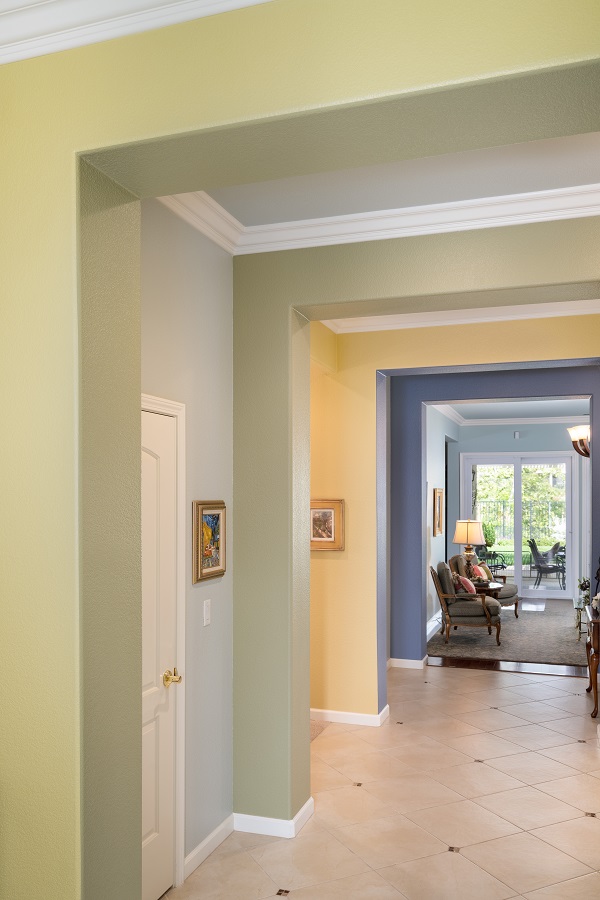
Neutral, soft shades are beautiful, but lush, rich colors are a fun change to add some more energy to the home. Urge your client to let you spice it up with a dynamic color palette. Let them know a complementary collection of uncommon shades will be a fresh way to reach the goals they have for their space.
Hersh carefully selected and applied these colors in a particular pattern to create a look that emphasized the architecture and crown moulding in the client’s home. The finished look adds depth with an array of colors stretching from the client’s entryway to her living room.
Surprising Accessories
Accessories are a place to really go wild and have some fun. Even a design dominated by a single color can be elevated with a dynamic accessory selection. Choose contrasting materials, textures and sharp pops of color to create visual interest in the space. This can easily be achieved with just a couple of well-chosen items, such as these neon lights made by the Neon Mama team. Lights now come in a range of colours and can completely transform a room after dark, which is especially exciting if you have kids or you’re holding a party. Additionally, encourage your client to bring forward treasured pieces that can be highlighted along with new items to add a more personal touch to the finished design.
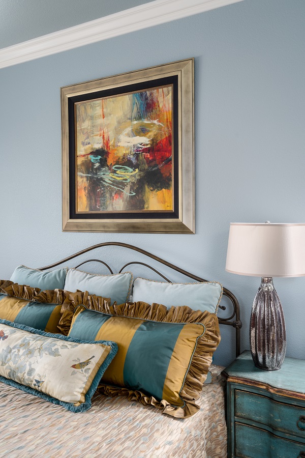
Custom bedding and pillow shams brought this bedroom together for Hersh’s client. Abstract artwork adds a surprising burst of color to the otherwise blue-tone space.
Dark Ceilings
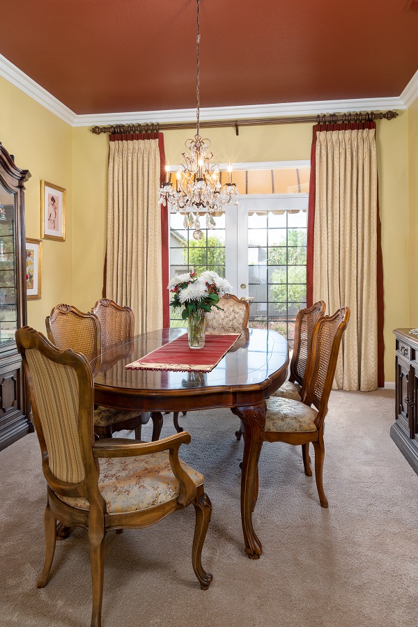
Another option for ceilings is to paint them darker than the walls. This might take some convincing, but let your client know the payoff will be huge.
This idea works best for high ceilings in rooms with a lot of natural light. When done correctly, the choice modernizes a room that is filled with antique- or classic-style furniture. Coordinate the ceiling color with the accessories and window treatments for a truly distinctive look.
This elegant dining room boasts a deep red ceiling and tall custom drapes Hersh made to accentuate the client’s 10-foot ceilings. The dark paint color broadened the space and added a little bit of drama, which was perfect for this entertainer’s dining room.
Consider these bold design choices when working with your next client. Don’t stop here, though! Your creativity is needed now more than ever. Let your mind dream up bigger, bolder ideas as we move into 2021. You may have to guide your client to trust your vision, but once they see the beauty of their finished design, they will be thrilled to tell all their friends about the bold design you helped them achieve in their home.


