During Home Textile Today’s virtual home fashion market, Nicki Gondell with the forecasting agency Trend House presented Italian Lab’s “Fall 21 Lifestyle and Design Trend Forecast.” Her slides featured five color stories and predictions for how they would impact fashion, home, textiles and knits. There were two that stood out because they offered unusual and stirring takes on the current interest in nature-inspired interiors.
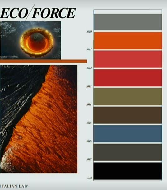
The idea of bringing the natural world indoors has been big for several years now. But Italian Lab has a take on that trend that couldn’t be further from the ubiquitous leaf greens, earthy browns and beachy blues. “Eco/Force is the acknowledgment of the power of nature and these climate crises we’re living through,” Gondell said. She specifically referenced the wildfires burning in California, Oregon and other Northwest states when she showed the color palette, which includes fiery shades of orange and red and sober charcoal and black. People are questioning both how they can reconnect with nature and protect it, and how they can find safety in their homes. As they ponder what the apocalypse might look like, these colors are at their front of their minds, and they’re finding their way into all aspects of their lives.

The rest of the color story includes olive and utilitarian blue, which is a reference to the people who protect us and make the things we find in our homes. As the planet changes, we’re increasingly appreciative of the people who work so hard to keep us safe. That appreciation is being reflected in fashion through more utilitarian, work-wear-inspired clothing in these shades.
In the home, expect to see more rough surfaces and textiles, more of a focus on found objects and more easy-to-clean or antimicrobial fabrics in addition to these colors.
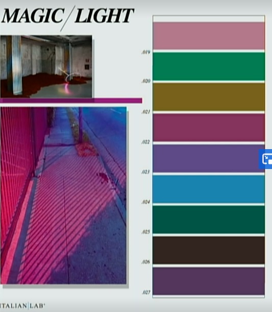
As they look for an escape from this reality, more people—especially young people—are turning to their computers and fantasy worlds for entertainment. The booming interest in online gaming influenced Italian Lab’s Magic/Light color story. “We see a lot of influence coming from the screen, which makes color lit, brighter and more mystical,” said Gondell. The combination of winter jewel tones and decadent summery greens create a palette that is “really bright, really saturated, really theatrical and great for the holidays. Some of these colors are almost like something you’d see in a black light.”

Textiles that accompany this story are shiny and saturated. Many include digitized or pixelized images that splash bright color across neutral backgrounds. Furniture and clothing (especially for women) are fantastical, with interesting shapes, bright color and luxe fabrics.
“Is this synthetic nature the future of nature? Are we going to be creating nature on our screens or in our labs?” asked Gondell. This color palette reflects that possibility.
She also touched on a few macro color trends:
- Expect to see more grown-up shades of pink. The new pink is “more dusty, more androgynous and works all year rather than just in certain seasons,” she said.
- Cool gray is becoming less popular as people move to warmer shades of brown in their homes. Where you’ll continue to see gray is as a tone in other colors. Blues, purples and many of the deeply saturated shades you’ll see in homes will have a decidedly gray cast to them.
- We often don’t think of purple as a “nature” color in the same way we see green, blue and brown. But think about grapes, eggplants and the beautiful way purple contrasts with autumn shades like rust and mustard, and you may begin to see it differently. Pops of deep purple can be a striking addition to nature-themed decorating schemes.


