In the Jan/Feb 2017 issue of Window Fashion Vision we covered some of trends to look for in shade fabrics for 2017. We also had some fun matching up some of the many 2017 Colors of the Year (COTY), as announced by various paint companies, with shade products already on the market. Of course, we put all this together before the “big” COTY reveal, Pantone’s 2017 pick of Greenery. But although a few other companies such as Shaw Flooring and Pratt & Lambert also choose greens as their COTYs, we’re picking purple.
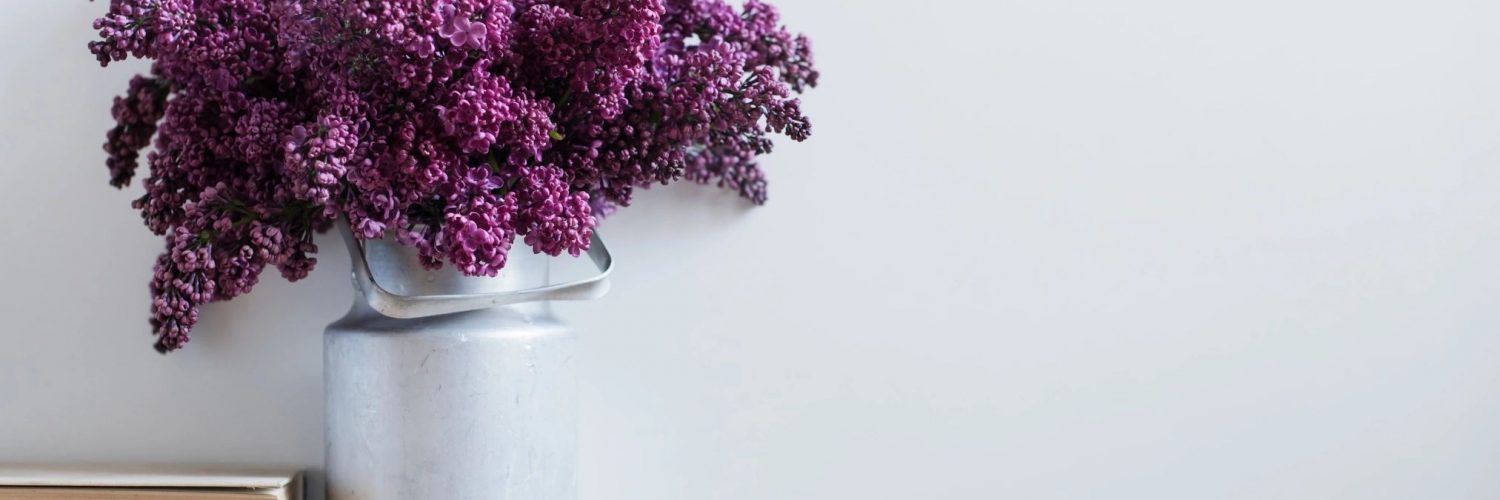
We already featured Benjamin Moore’s Shadow (2117-30) in Jan/Feb—a rich amethyst that transforms from muted lavender to almost black depending on the lighting. But while Shadow may be the most dramatic purple pick, you can also choose from Violet Verbena (1169-5), the PPG COTY, or Glidden’s Byzantine Blue (50BB 32/117), a purple in everything but the name. But, since we already highlighted deep purples in the magazine, we decided to put together another gallery featuring the palest of the 2017 COTY purples, Cloudberry (OL677.3) from Olympic Paints.

This soft violet reflects “society’s urge to find a space apart from constant connectedness, and to create balance by establishing homes as places to refresh,” said Dee Schlotter, senior color marketing manager, Olympic Paints & Stains brand. “Cloudberry conveys retreat from the pressures of daily life, encouraging meditation and mindfulness, inspiring more focus and less stress.”


Purple has long had mystic connotations through tarot, alchemy, and even as the color of the crown chakra, representing wisdom, transformation, and creativity—surely a fitting color for what is already shaping up to be a tumultuous year!


